Brand Guidelines
2025
Brand Guidelines
2025
Concept
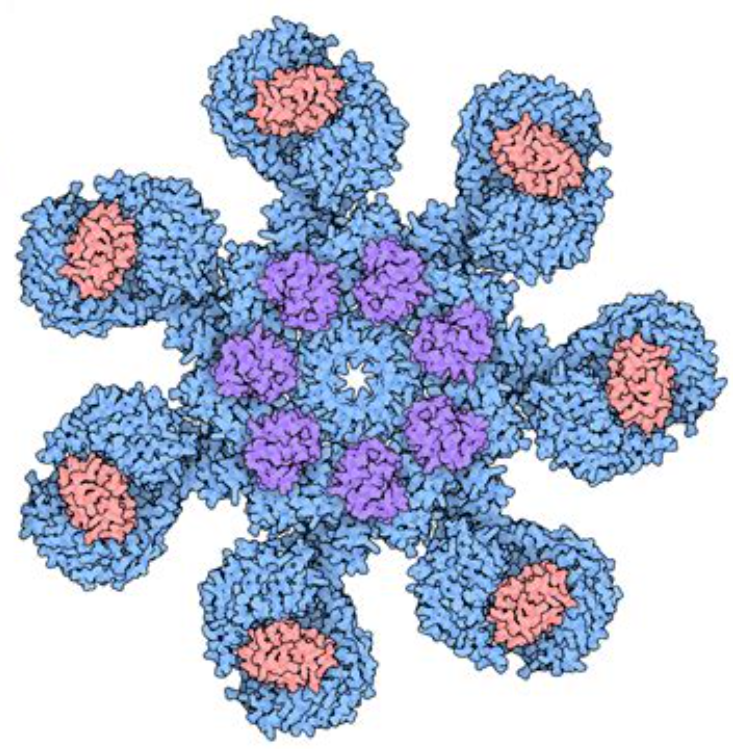
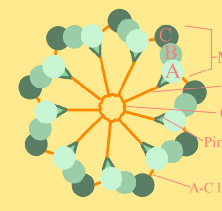
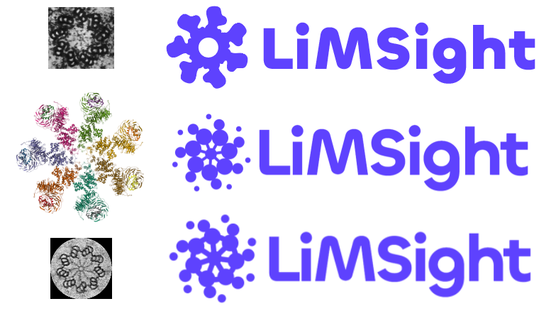
Seven outer nodes inspired by the apoptosome, a molecular structure that coordinates complex cellular processes. Central spokes drawn from the centriole, nature's organizing hub. Data pulled inward, not radiating out. Information finding its center.
Most logos are perfectly symmetrical, machine-precise. Ours is deliberately imperfect. Each node slightly different, hand-drawn, alive. Because real thinking isn't mechanical. It's organic.
Design Inspiration
The Icon
In Motion
System
Full Mark
Primary application

Wordmark
Horizontal contexts
Icon
Minimal spaces
Logo
Maintain breathing room equal to the icon height on all sides. This ensures the logo remains legible and impactful.

Approved Backgrounds
Avoid
280°
Indigo / Primary
You don't need to remember this number or anything - This slide just looks cool.
Brand
Indigo is the workhorse. Use it for CTAs, buttons, links, key UI elements, and anywhere the brand needs to show up boldly.
Lavender, Blue, and Cyan appear in gradients, rotating through lists, or adding visual variety. They complement Indigo, never compete with it.
Cyan shouldn't appear solo as a primary action color. It works best in gradients or as part of a color rotation with its siblings.
OKLCH color space for perceptual uniformity. All brand colors at 54% lightness for consistent vibrancy across hues.
Indigo
Primary
#5e42fe RGB 94, 66, 254 HSL 249° 99% 63% OKLCH 0.54 0.26 280 Lavender
Supporting
#9854ff RGB 152, 84, 255 HSL 264° 100% 66% OKLCH 0.54 0.25 305 Blue
Supporting
#007dff RGB 0, 125, 255 HSL 211° 100% 50% OKLCH 0.54 0.20 255 Cyan
Supporting
#0891b2 RGB 8, 145, 178 HSL 192° 91% 36% OKLCH 0.54 0.15 210 Navy
Dark / Text
#14144c RGB 20, 20, 76 HSL 240° 58% 19% OKLCH 0.22 0.09 280 White
Background
#ffffff RGB 255, 255, 255 HSL 0° 0% 100% OKLCH 1.00 0.00 0 Color System
Keep it simple. Stick to 54% and 48% for most use cases. But OKLCH makes the full spectrum available if you need it. Same chroma, same hue, just slide the lightness.
Our primaries sit at 54% lightness because that's where AAA contrast lives on white backgrounds. If you venture into lighter shades, aim for at least AA, or be conscious you're trading accessibility for aesthetics.
Atmosphere
We don't use hard linear gradients. Instead, brand colors become soft, blurred shapes that create depth and atmosphere.
Large blurred shapes at low opacity create an aurora-like effect. Circles, ovals, stretched blobs. Be creative with the forms, but keep them soft and diffused.
Use 2, 3, or 4 colors. There's no strict rule. Layer them, let them overlap and blend naturally. The key is subtlety and depth, not precision.
Properties
circles, ovals, blobs, lines, etc 80-150px 8-15% (watch text) see brand palette Shown Here
Visual Language
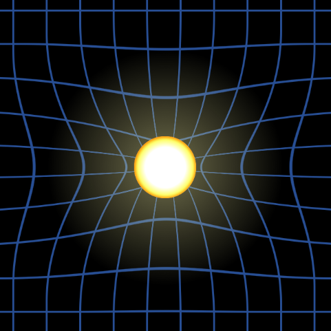
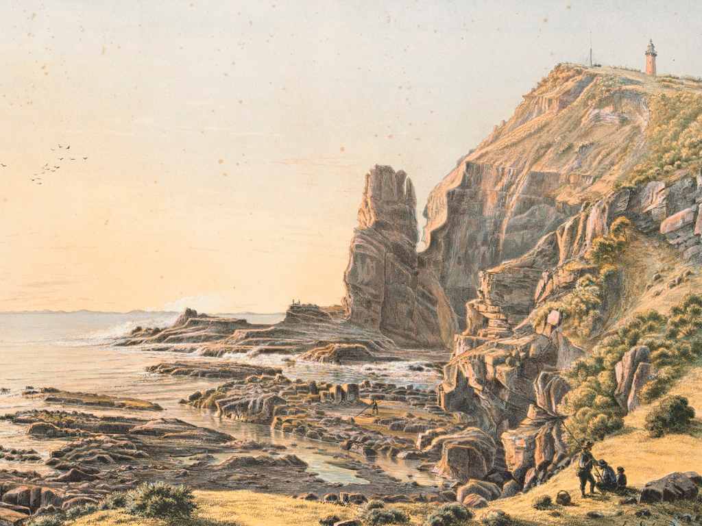
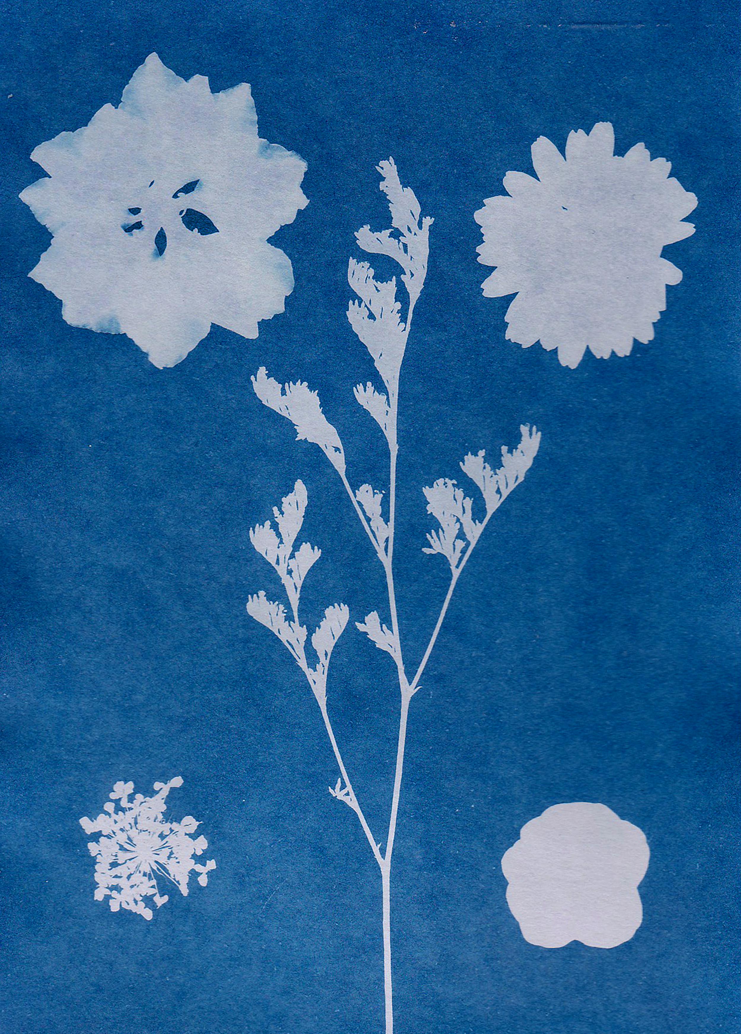
Personal & Authentic
Sourced from archives, libraries, and artists. Hand-drawn illustrations, vintage scientific diagrams, organic textures. Used when conveying warmth, humanity, and the story behind the technology.
About pages · Blog posts · Team content
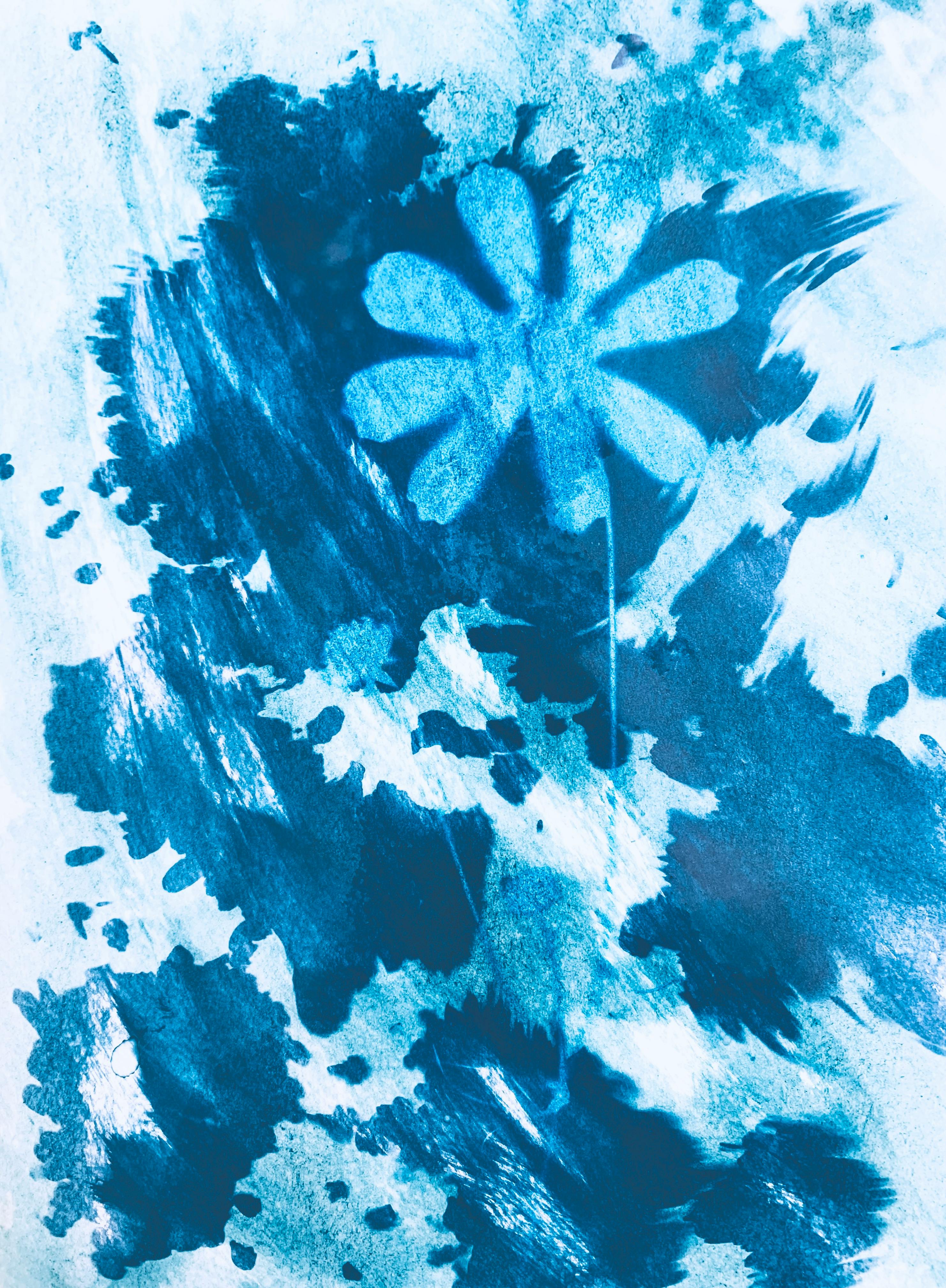
Atmospheric & Subtle
Photography desaturated and blended over brand colors. Creates depth and atmosphere without competing with content. The photo becomes texture, not subject.
Hero backgrounds · Section dividers · Motion
Digital & Technical
Clean geometric shapes, solid color fills, precise outlines. Minimal iconography with consistent stroke weights. Used when demonstrating capability and precision.
Product UI · Feature diagrams · CTAs
Transformed work is yours, but redistributing stock photos usually requires an active subscription. Public domain and Creative Commons are great, just verify the source.
Technical
Marketing sites follow these guidelines. Built on Tailwind for consistent, responsive layouts. OKLCH colors and CSS custom properties for theming. The foundations are there. Beyond that, trust your eye.
Typography
Bricolage
Headlines. Display. Impact.
Specimens
Primary
Aa
Display / 500
ABCDEFGHIJKLMNOPQRSTUVWXYZ
abcdefghijklmnopqrstuvwxyz
0123456789
Secondary
Aa
Body / 400
ABCDEFGHIJKLMNOPQRSTUVWXYZ
abcdefghijklmnopqrstuvwxyz
0123456789
Voice
From rugged coastal cliffs and historic goldfields. A culture where you repair rather than replace. We enhance existing systems, preserving value, modernizing with purpose.
We are
Clear, direct, helpful. Technical when needed, human always.
We avoid
Jargon, hype, corporate speak. No "synergy" or "leverage."
We sound like
A knowledgeable colleague, not a salesperson or a textbook.
Principles
Practical and straightforward.
No consultant speak.
Every action logged, timestamped, traceable.
Trust through transparency.
Developer first.
Any skilled developer can configure.
No vendor lock-in.
You control your systems.
Seven nodes.
Drawn inward.
Ready to answer.
But wait...
Looking Ahead
For Brand V2, we're drawn to warmer, more natural aesthetics. Soft gradients, organic illustrations, and earthy tones that feel approachable yet sophisticated.
The goal is to move beyond clinical coldness while maintaining the trust and clarity our users need. Illustrations and warmth will be key.
Looking Back
Making a logo is hard. You need to convey what it is and the feeling with as few elements as possible. A centriole with 40+ elements wasn't going to work at small scales.
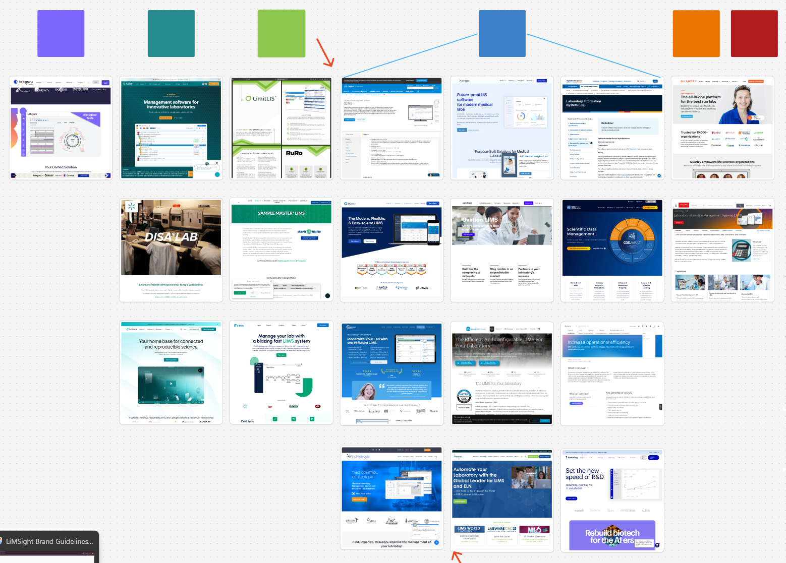
We also learned everyone else in the LIMS space is white, blue, and boring. Light mode will make us feel trustworthy, but indigo helps us stand out.
Thank you, we hope you enjoyed the presentation.